2021 COVID Forecast & 2020 Review
Key Points:
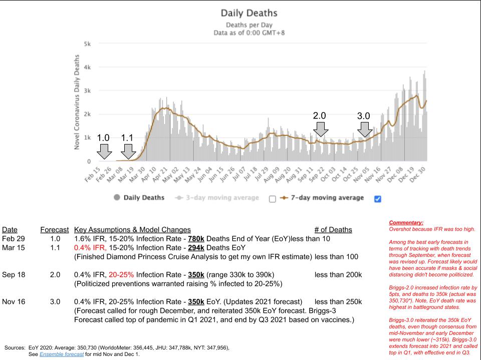
- Briggs-3 forecast 350,000 deaths in the US at the end of 2020. The US ended with a remarkably close to forecast with 350,730.
- 2021 Forecast Briggs-3 expects a decline in the rate cases and deaths in Q1 and Q2, with an effective end to the pandemic by Q3. However, there are many wildcards that I'm tracking that could throw the US off forecast, including slower vaccination rates and mutations that spread the virus faster. If you'd like me to add your state, see the note in the article.
- Briggs-3.1 forecast approximately 780,000 deaths in the US at the end of 2021. Q1 estimates 577,886 (+/- 30k). End of February forecast of 507,414 (+/- 25k). End of January Short Term Model forecasts 435,000 deaths (+/- 15,000).
- Here's a comparison to other models: COVID Forecast hub only projects 4 weeks in advance. Their December 2020 forecast was too low by more than 15,000. Their January 30 figure is 420,900 deaths (95% prediction interval: 405,210 - 438,190). IMHE forecasts 456,238 at the end of January. Briggs-3.1 is in the middle at 435k (+/-15k). IMHE projects three months out, and their end of February forecast is 527,209 (504k to 554k) vs Briggs-3.1 of 507,414 (+/-25k). IMHE end of Q1 projects 566,479 (538k to 599k) vs. Briggs-3.1 577,886 (+/-30k). Source: IMHE as of January 2, 2021.
- As with 2020, there are key assumptions that could prove to be wrong, and it is valuable to consider the key assumptions summarized in this article and detailed in the model whitepaper. You play a role in determining our trajectory. The model highlights how you can help end the pandemic sooner rather than later.
- In addition to tracking daily forecast vs. actual, the dashboard includes a blog of key news stories and academic papers I'm tracking that are directly relevant to the forecast.
A Brief History of my 2020 Forecast:
I started covering the Coronavirus toward the end of January, when I wrote review of the model coming out of China. That model from China showed an end to the outbreak with around 10,000 cases, and my analysis suggested it was way off. My analysis showed we could see the virus spreading to millions quickly. Speaking of "cases" it is worth repeating a few sentence from the end of the first article:
Each number is a person with their own dreams and fears. My heart goes out to those with the virus, and the uncertainty that goes with not knowing if they are the unfortunate that won’t recover. My heart goes to the families that are concerned for their loved ones health, and the health of the family as a result of exposure. I am grateful for all the medical professionals that are devoting themselves to slaying the virus and mitigating its effects. Godspeed.
By February, I had my hands on patient level data on the first 50 fatalities in China and calculated an age distribution. I reported about 80% of the deaths were among the 65+ population. My forecast for were we would land in terms of confirmed cases in February was very accurate (within 1 day of the actual).
However, early models, including my 1.0 Forecast, had a very poor idea of how fatal the virus would ultimately prove to be. The data coming out of China under-reported actual infections, which caused many to overestimate the infection fatality rate. One headline-grabbing projection estimated COVID could kill up to 2.2 million Americans by the end of the year. My initial estimate was lower (780k), which I positioned as "How Bad It Could Get" because I understood the infection fatality rate was poorly measured, and likely a bit too high. I was scouring the news for what are known as "closed population" cases to study to get a more accurate Infection Fatality Rate (IFR) measure.
A closed population is where the population is well defined and isolated. This could be a school, elder care facility, small town, or a cruise ship. The key is to have a defined total number of people where the infections are known, because everyone is tested, and an accurate measure of fatalities along with a robust set of profile information such as age, sex, health conditions.
In early February, the Diamond Princess Cruise Ship was quarantined in Japan. While not at all ideal for the 3,700 passengers and crew, it was the first closed population where everyone would get tested, and the fatality rate could be observed and calculated. The population skewed older, but with the age distribution I had calculated based on the Hubei data (and subsequently data published by CCDC on the first 2000 deaths by age), I could generate a reliable IFR. I explained the analysis in this academic working paper and calculated a 0.4% IFR. This changed my forecast of deaths from 780k to about 300k. My forecast of 15-20% of the US infected by end of the year was unchanged, as was my expected seasonality of a summer reprieve and a significant surge in the fall. I labeled this new forecast Briggs-1.1. At the time, there were fewer than 200 deaths in the US and I was forecasting more than three orders of magnitude increase in just over ten months.
While I shared this new IFR figure in the ARF Town Hall, I thought it was better to point out that we could exceed this figure if our hospitals became overwhelmed, and we didn't take public health actions like wearing masks and staying home to make it harder for the virus to spread. I was more concerned about the degree to which the White House was downplaying what was obviously a very risky virus. By my calculation, in March, the virus was at least five times more deadly than the flu, and at least twice as infectious. Bob Woodward's taped interview confirms the White House understood this risk at the end of January.
I updated my model in September, when the rate of deaths was flat to declining. I was forecasting a significant increase to the trajectory through the end of the year, and labeled this forecast Briggs-2. For those in the analytic business, you'll appreciate how hard it is to create a model that anticipates turning points with exponential growth -- especially when growth is currently flat. My model uses an overall infection rate and infection fatality rates, and I increased the infection rate by 5pts in my model based on a politicization of the virus, as shown in leading polls released that month. The increase in infection rates translated into increasing the projection of deaths by 50,000, from 300k to 350k, (with a range of 330k to 394k).
Briggs-2 forecast proved to be the most accurate forecast for the year. The forecast of 350,000 compares to the actual of 350,730 average of the three leading daily repositories I've cited in my articles over the past year (New York Times, John Hopkins University and World-o-meter). By comparison an ensemble of over 50 different forecasts from December underestimated COVID-19 deaths in the US, predicting 317,100 deaths by December 26 (95% prediction interval: 303,203 - 329,060). The actual for December 26 was 339,951 (above top of 95% range by more than 10,000!).
Some forecasts missed it by much more. A four-week forecast from the University of Massachusetts Amherst’s Reich Lab predicted, daily deaths "in the range of 1,643 to 1,886 through Dec. 26." In contrast, the Briggs-2 model expected an average daily death of about 2,500 with several days crossing 3,000. The Amherst model missed it by over 20,000.
I believe the reason my model performed better was factoring in the influence of the Presidential campaign and the politicization of mask wearing, etc. meant I raised my overall infection rate forecast by 5pts for the year back in September.
So what if my 2020 Forecasts was pretty good -- what about 2021? Will we really see rapid decline in Q1 and Q2, and an end to the pandemic by Q3?
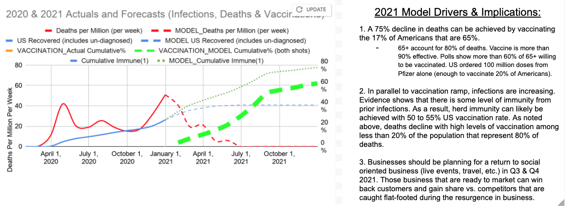
Personally, one of the best days in 2020 was the day I read the Phase 3 topline vaccine trial data. Successful Phase 3 vaccine trials was a moment to celebrate. I enthusiastically opened up my model, and laid down a vaccination rate schedule and could see that life had a good chance of returning to a semblance of normal. Achieving this forecast would mean so much to so many, including my wife. This model became Briggs-3, which I published in this Research World article in November 2020.
Both this Briggs-3 model and my previous models expected December and January to be rough, with a significant increase in deaths driven mostly by the holiday interactions. My forecast expected this surge to work through the hospitals by the end of January, with the rate of case increases at a slower pace in January compared to December.
In Briggs-3, I was forecasting downward pressure on the virus from natural immunity and vaccinations. I discounted the White House estimates of how many people would be vaccinated by the end of the year, but expected a meaningful ramp in Q1 and Q2 2021 (the dashed green line in the chart).
I acknowledged, in my Research World article, that the forecast leans a bit on the optimistic side. In part, I want the readers to recognize we can end this pandemic sooner rather than later by achieving a fast pace of vaccinations, particularly among those 65 and older. But, I also recognize that there are headwinds. For example, the goals for COVID vaccinations are much higher than the highest Flu vaccination rates for the last decade. There is a deep political and gender divide such that the majority of Republican women say they will not get vaccinated. There is a lot of work to do to achieve the vaccination goals.
How is Your State Doing? Use the Open Source Forecast To Find Out.
2021 Forecast Briggs-3 expects a decline in the rate cases and deaths in Q1 and Q2, with an effective end to the pandemic in Q3. However, there are many wildcards that I'm tracking that could throw the US off my forecast, including slower vaccination rates and mutations that spread the virus to more people, on average.
I want you to be able to use this model and dashboard for your family and your business. I launched a dashboard for you to get updates (daily refresh by 8am Pacific Time), so you can track the Model vs. Actuals -- especially for the vaccinations. Check out the blog where I succinctly summarize news that may cause me to change the Forecast.
If you'd like me to add your state to the dashboard, let me know on Twitter @rexbriggs, and I'll add it. It takes about an hour to replicate a state and check the output - from then on, it should run automatically. Countries are a bit more difficult, as I'm using a US Github repository, but I'm willing to look into migrating to a more global dataset, and happy to work with any volunteers that are good with automating ETL of bigger data sets. We're all in this together.
How are we doing so far?
Even though I cut the White House estimates by more than half, the White House still came up short. The plan was for 20 million people to be vaccinated by end of 2020. This was a downgrade from the original 100 million figure shared before the election. Given the track record of the White House, I chose not to use the 100 million pre-election figure. Even the 20 million figure seemed aggressive to me, given weekends and holidays, and therefore my forecast was for 10.5 million first dose vaccinations by the end of the year. The US missed my discounted figure and we are still playing catch-up. To see by how much, try out the dashboard.
You can make a difference. If you are in media, you can donate media to the Ad Council, or your state's local communication efforts - contact me on Twitter @rexbriggs. If you can help with social media, get in touch with your local state or county immunization effort. I've been working with doctors in my state that are posting on NextDoor and Facebook an invitation to as an MD questions. They are also organizing live zoom calls for the community to get their questions answered. There are lots of ways to get the facts out and help people get their questions answered. It is particularly important for those that are 65 and older to plan for their vaccination now, and to get their vaccination as soon as available.
I believe the reason most models (including my earlier forecast) underestimated where we'd end the year is a failure to integrate the degree of politicization in how we respond to the virus. The political divide remains a serious threat to ending the pandemic in 2021. The news I track includes polls and reporting that show only about half of front-line health workers haven't gotten vaccinated, even though they have been offered the vaccine. We need to do better.
As presented at the ARF December 6 forecasting webinar, I am expecting about 535k cumulative deaths at end of 2021 (30 to 35% infection rate, with an upper range of 590k deaths). I expect I may be raising the forecast if the UK variant expands in the US and vaccinations continue to lag forecast. We could trend into the 40 to 50% infected range, and see cumulative deaths easily exceed 600k in 2021. While I would hope infection fatality rate would decline over the next year as vaccinations expand and therapeutics continue to improve, we are in a race to get as many people vaccinated as quickly as possible to beat this virus. My Briggs-3 model expects 55% vaccination rate by August, and 62% by the end of the year, while Fauci and others are aiming much higher (85% by end of the year).
I am proud to be working with the Ad Council on an national level and locally with my state's Immunize Nevada campaigns. If you can volunteer, or share information with your network, it can make a difference in ending this pandemic. Here is just one example. With just 100 million doses, we could vaccinate nearly 100% of the 65+ population, which account for 80% of all deaths.
In fact, the rate of death from COVID-19 for this age cohort is currently 1 in 199 (see dashboard), so any risk of the vaccine is much lower than the risk of getting COVID and dying. Those with confirmed COVID are 98 times more likely to die of it than those 45 and under. Compared to the side-effects from the vaccine, the risk of not getting vaccinated is much more grave. You can see more of the implications of different age cohorts getting vaccinated in the Vaccine simulations in the dashboard. Check out what a big difference we can make getting those 65+ in our lives to vaccinate.
As I wrote in my first forecast, a forecast is not destiny. We control many of the variables and can improve the outcome. I appreciate you reading this post and sharing the message and the data.
Related Analysis
- 6 May, 2020:
The COVID Persona Analysis
- 28 April 202:
Guns, Germs And Beer. Four Phases of the Economy
- 15 April 2020:
Good News + A Number To Track
- 2 April 2020:
The Math Of Why Herd Immunity Isn't Viable in 2020
- 1 March 2020:
How The Vaccine Can End The Pandemic By Q3 2021
- November 2020:
Forecasts Vs. Actuals: