15 April 2020—First the good news: As first projected in my analysis of location data on March 25th, Social Distancing is working. The rate of infections spread is slowing.
In this article, I am going to give you a really easy number to track how we are doing. You can use to estimate what the rest of the year is going to look like in terms of COVID-19.
Let's take a closer look at the chart and Confirmed Cases. You can see a decreasing trend and that decrease is good news. Here is how you can calculate the trend: Take today's total Confirmed Cases (607,670 in the US as of 14 April), subtract from that the total Confirmed Cases a week earlier (396,223) and then divide by last week's count (396,223). That gives you 53 percent weekly growth rate - the gray line in the chart below.
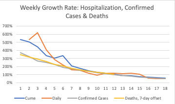
Some argue you can't use Confirmed Cases because we aren't testing enough. OK, then use hospitalizations. The number of people in the hospital, and cumulative hospitalizations is a good measure because it doesn't depend of testing. If someone is sick enough to be hospitalized for COVID19, it gets reported, and The COVID Tracking Project picks it up, and I was able to analyze it. You can see hospitalizations (blue and orange lines) were increasing by 500 percent per week in mid-March and now they are increasing about 55 percent. There is still a lot of pressure on the health system in a lot of places, but this flattening of the curve is good news.
Some argue deaths should be used as the key measure of the virus spread. They argue the hospitalization numbers are incomplete -- not all states report it. Twenty states + Guam reported cumulative Hospitalizations. Thirty states reported daily hospitalizations. I used the average of those reporting provides a good measure of the rate of spread of the infection and made my source data available in a Google Sheet. But, if hospitalizations aren't a measure you want to use, we can look at Deaths. We see a slowing rate of weekly growth as well.
Deaths lag about three weeks behind infections, whereas hospitalizations lag by about two weeks (see my previous analysis for the source data). I therefore have offset the rate of growth in the number of deaths by 7 days. Deaths have declined from over 400 percent weekly increase in Mid-March to 103 percent as of yesterday. I would expect the weekly increase in number of deaths to decrease to about 50 percent by next week, in line with what we are seeing in the hospitalizations and confirmed cases.
Any way you look at it, we are making progress in slowing the spread of COVID-19. If you saw the article I posted on March 29th showing Italy's declining growth rate, or the article on March 17th about the the curve flattens after about two weeks of lock-downs, then you know this is the pattern my model predicted. Some additional good news is that the location data I've been working with from smart phones is giving us a leading indicator of COVID-19 spread.
I used this data to predict the flattening of the curve three weeks ago. I continue to analyze location data, and the latest data I have is as of Monday. It shows we are holding down travel. There was a slight (2 percent) uptick in miles traveled this week. But this is much lower than the typical uptick in travel for Passover/Easter Weekend.
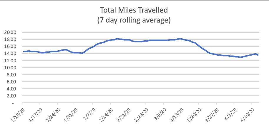
In addition to travel being down compared to February and March, my sense is that the travel behaviors are qualitatively different. When going out, more people are wearing masks, avoiding people, washing hands, applying sanitizers etc. I would therefore expect less spread of infection per mile traveled than compared to a month ago. In other words, based on the location data, we should expect the rate of COVID-19 to continue to slow.
A Number To Track
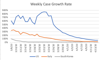
Using the same calculation I shared on the rate of growth, South Korea's weekly rate of growth is now 2 percent. Italy's is 20 percent. The US rate is 53 percent (See chart below for trend). We have to keep flattening the curve to get below 20 percent, and I'll explain why.
Why do we have to be below 20 percent? What happens if we lower the rate of growth to 30 percent -- but not quite 20 percent? Wouldn't that be good enough?
At the risk of oversimplification, think of the growth rate like a sea-saw. There is a point where the rate of spread causes the virus to to tilt in a direction that ultimately deprives the virus of enough hosts to sustain its existence. Consider the fact that if a virus doesn't infect another person in a two to three-week window, it dies. If it infects more than one person, it lives on, and if it infects two or more people, it grows.
Growth rates lower than the 400 percent we experienced recently will look a bit deceptive at first. For example, a 30 percent weekly growth rate will initially look like we are extinguishing the virus. You see the curve flatten like this:
This chart is my best estimate of active infections in the US, and the decreasing rate due social distancing and recoveries (or deaths). My model shows we've past the peak of infections earlier this month. We've gone from a doubling every three days to doubling once every eleven days. Thirty percent is an even longer doubling cycle, but it does still tilt toward accelerating growth.
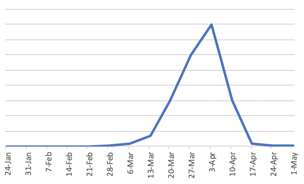
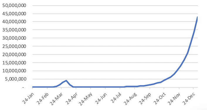
Here is why we need to get below 20 percent weekly growth in cumulative cases, hospitalizations and deaths: Let's say we reduce the number of infected all the way down to just 10,000 people in the community. "In the community" is code for not knowing who these 10,000 are. Community spread occurs when there is inadequate testing and tracing. These folks infect others, and since many have mild or no symptoms (but are infectious), they infect others. For several months, the number of new cases won't look like much to worry about given what we've just experienced. Things will seem under control for about four months or so. But then, the critical mass of community infections builds into a really big problem. The chart below uses a 30 percent weekly growth rate with some low level of early detection testing and self-quarantine measures removing a few of those infected, but most of those infected keep infecting others. You can see it produces a second wave, and it gets ugly in the fall. It is basically what my Forecast 1.0 predicts will happen in the US by the end of 2020.
I think we'd all like to avoid this scenario. The way to avoid this scenario is to #1 get the number of infected down as low as we can, and #2 aim for less than 20 percent weekly growth.
Getting the number of infected down as low as we can is the point of our global lock-down. Each person that participates in the #StayHome movement makes it much harder for the virus to spread. #StayHome gives time for those that have the virus (many of whom don't even know they have it) to cross over from the infectious period to recovered (and likely somewhat immune to re-infection). It gives times for the medical community to treat those currently infected, to research therapeutics, and make progress on vaccine testing.
Expanded testing is going to be essential to achieve early detection and individual quarantines. Wearing masks, social distancing, washing hands, etc. will be our reality until a vaccine is broadly implemented. Herd Immunity, as I showed in a recent analysis, isn't going to be a viable solution in 2020, but serological testing to find out who has some level of immunity can help.
My hope is that we will get below 100,000 infected in the US by the time people begin to reduce social distancing. My models are showing that we will be more than four times that number by May 1st. We need more time to reduce the number of infected and lower the weekly rate of growth below 20 percent.
Some will argue we don't have more time. More than 17 million people are now out of work. The number grows daily. We need to open the economy, and that means relaxing social distancing ASAP. But the math is such that relaxing social distancing a few weeks too soon will nullify the sacrifices of so many people over the past month.
I am sure we will hear that there are many ways of managing the risk of COVID-19, and I am sure many of the approaches will make good sense. That said, I'll be tracking weekly growth rate as my barometer. Can I suggest you keep an eye on the weekly growth rate too? Now that you know how to easily calculate the weekly growth rate, you've got a crystal ball of sorts. You can see a few month into the future and anticipate whether we should expect a hockey stick growth in infections in the fall, or if we are tilting on the sea-saw the other way, toward a virus that is burning out, so we can more confidently invest in the future.